Documentation Index
Fetch the complete documentation index at: https://docs.builderbox.ai/llms.txt
Use this file to discover all available pages before exploring further.
Component Structure:
- Most landing and feature components are in
@/features (e.g., @/features/home/, @/features/content/).
- General-purpose, UI, and utility components are in
ui/ (e.g., ui/button, ui/card).
- Usecase Based Components are in
@/components/ (e.g., pricing-selector, testimonialscarousel).
Home/Landing Components (@/features/home)
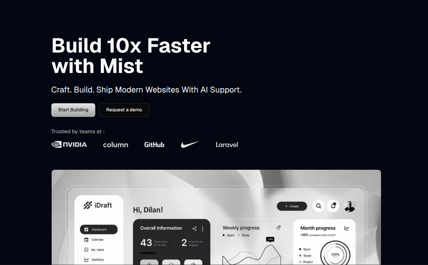
Hero Sections


import Hero from "@/features/home/hero1";
<Hero />
Navigation


import Navigation from "@/features/home/navigation1";
<Navigation />
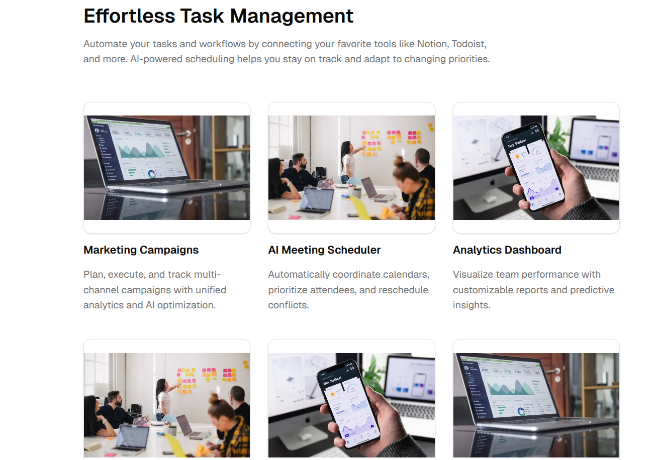
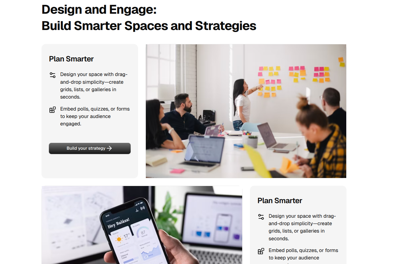
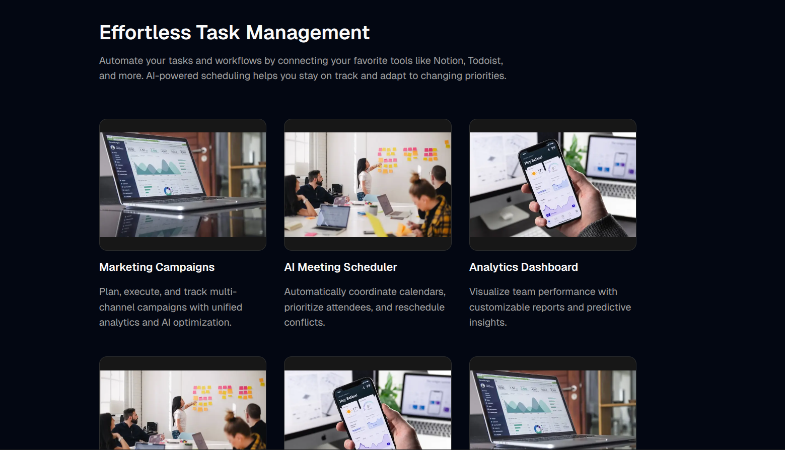
Features


import Features from "@/features/home/features1";
<Features />
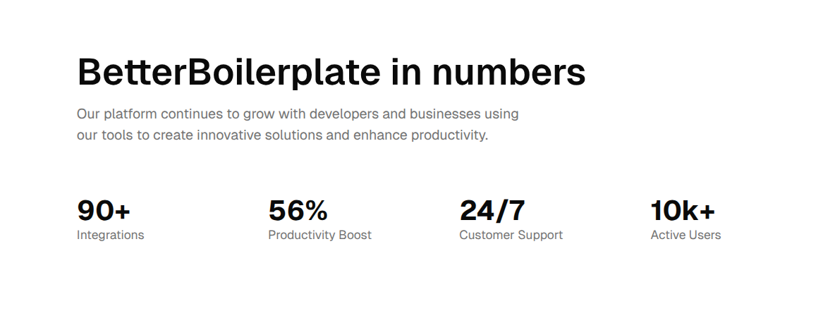
Stats


import Stats from "@/features/home/stats1";
<Stats />
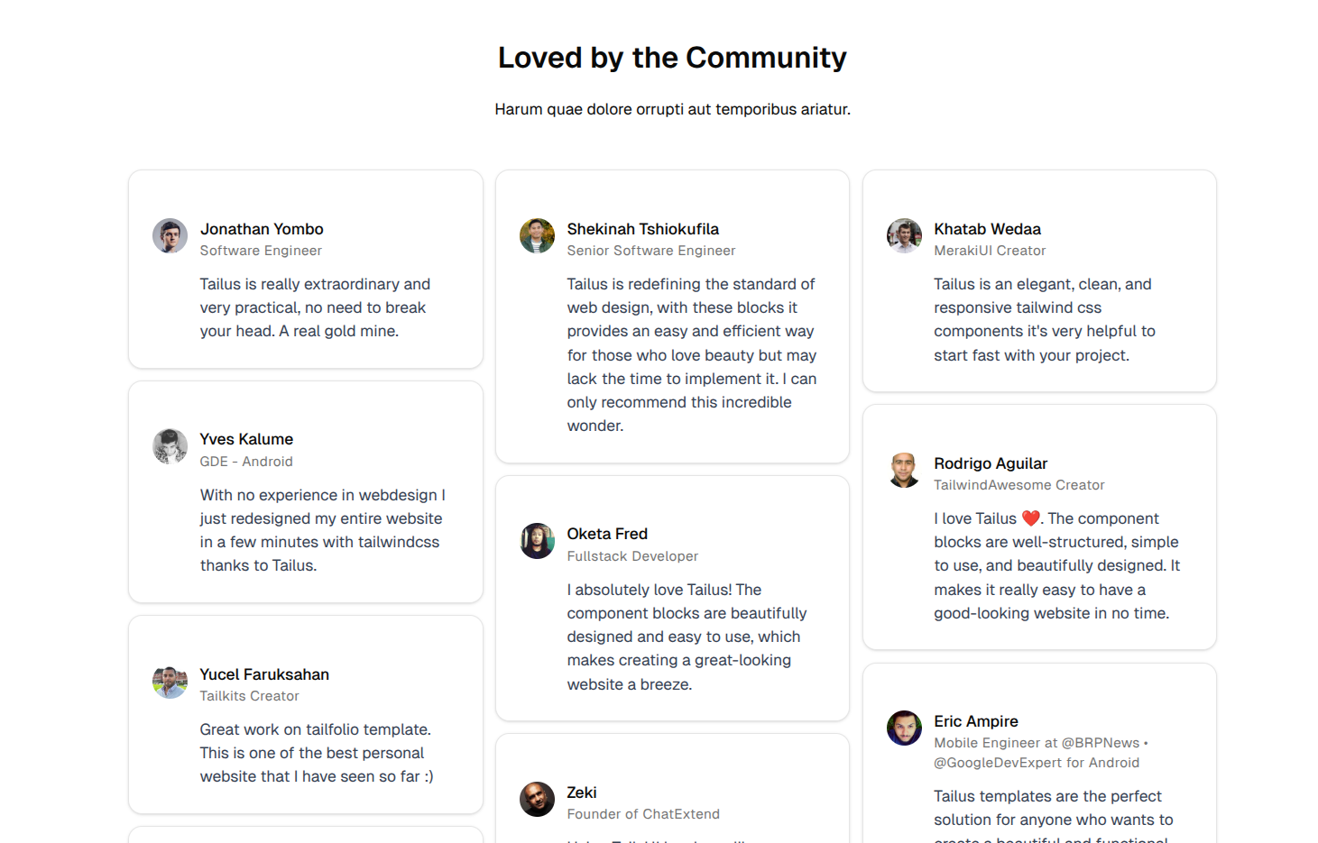
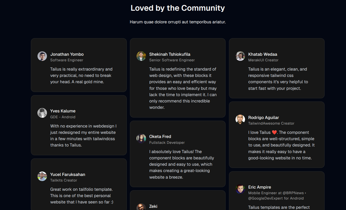
Testimonials


import Testimonials from "@/features/home/testimonials1";
<Testimonials />
Pricing


import { Pricing } from "@/features/home/shared/pricing";
<Pricing />
Call to Action


import CallToAction from "@/features/home/call-to-action1";
<CallToAction />
Contact


import Contact from "@/features/home/contact1";
<Contact />


import Footer from "@/features/home/footer1";
<Footer />
Bento Grid


import BentoGrid from "@/features/home/bento-grid1";
<BentoGrid />
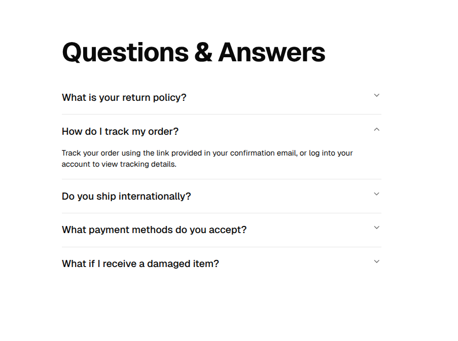
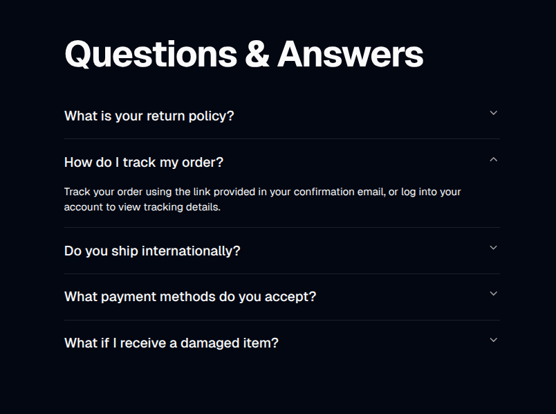
FAQs


import FAQs from "@/features/home/faqs1";
<FAQs />
Logos


import Logos from "@/features/home/logos2";
<Logos />
General & UI Components (ui/)
- UI Primitives: All components in
ui/ (e.g., button, input, card, dialog, dropdown-menu, tabs, table, badge, avatar, etc.)
Usage Example:
import { Button } from "ui/button";
<Button variant="outline">Click me</Button>
Top-Level Components & Usage
Below are usage examples for each top-level component (not in ui/ or any subfolder), organized by use case. Each component preview image appears before its code example.
Testimonials Components
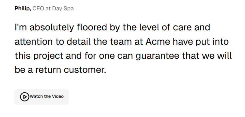
TestimonialsSingle

import TestimonialsSingle from "@/components/testimonials-single";
<TestimonialsSingle />
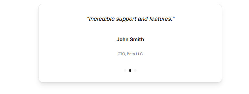
TestimonialsCarousel

import { TestimonialsCarousel } from "@/components/testimonials-carousel";
<TestimonialsCarousel />
TestimonialsAnimated

import AnimatedTestimonialsDemo from "@/components/testimonials-animated";
<AnimatedTestimonialsDemo />
TestimonialSingle

import { TestimonialSingle } from "@/components/testimonial-single";
<TestimonialSingle />
TestimonialGrid

import { TestimonialGrid } from "@/components/testimonial-grid";
<TestimonialGrid />
Pricing Components
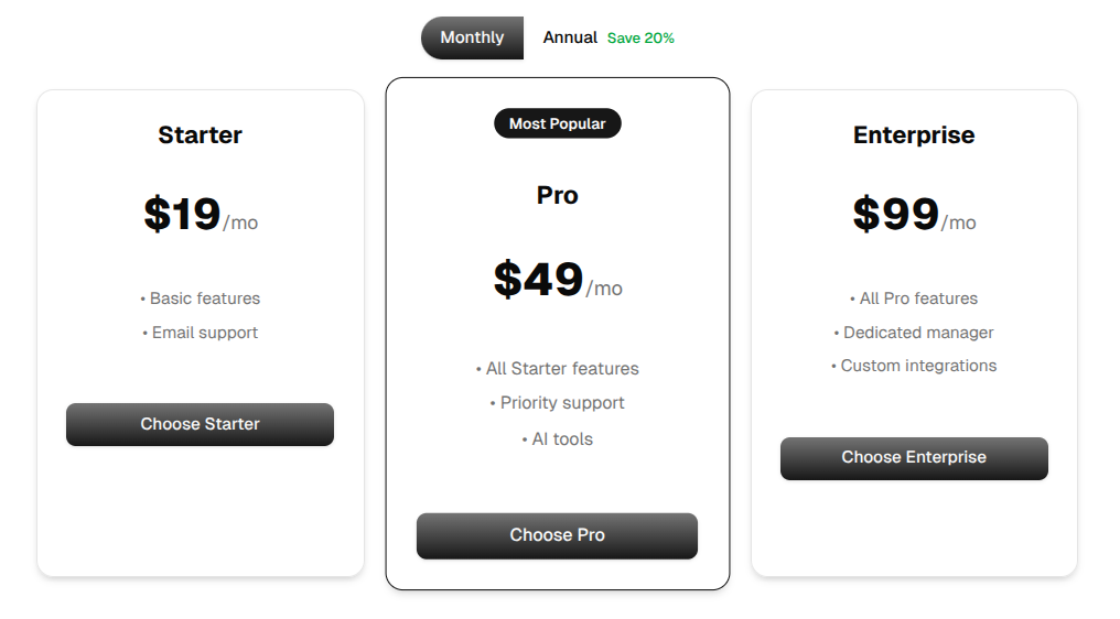
PricingSelector

import { PricingSelector } from "@/components/pricing-selector";
<PricingSelector />
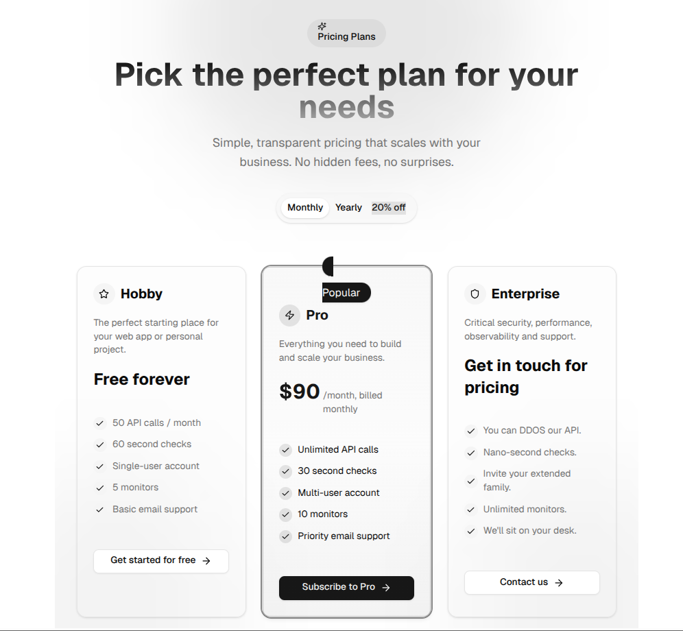
PricingWithModals

import PricingPage from "@/components/pricing-with-modals";
<PricingPage />
SimplePricing

import SimplePricing from "@/components/pricing copy";
<SimplePricing />
Feature/Content Components
FeatureGrid

import { FeatureGrid } from "@/components/feature-grid";
<FeatureGrid />
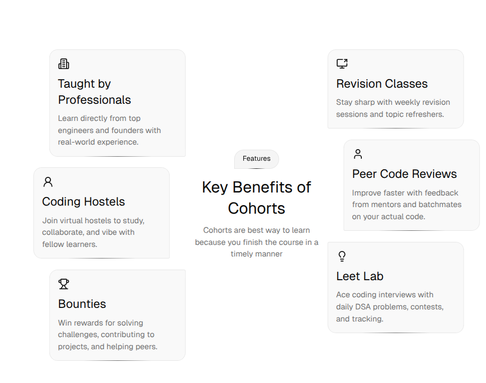
FeaturesCirculated

import Feature3 from "@/components/features-circulated";
<Feature3 />
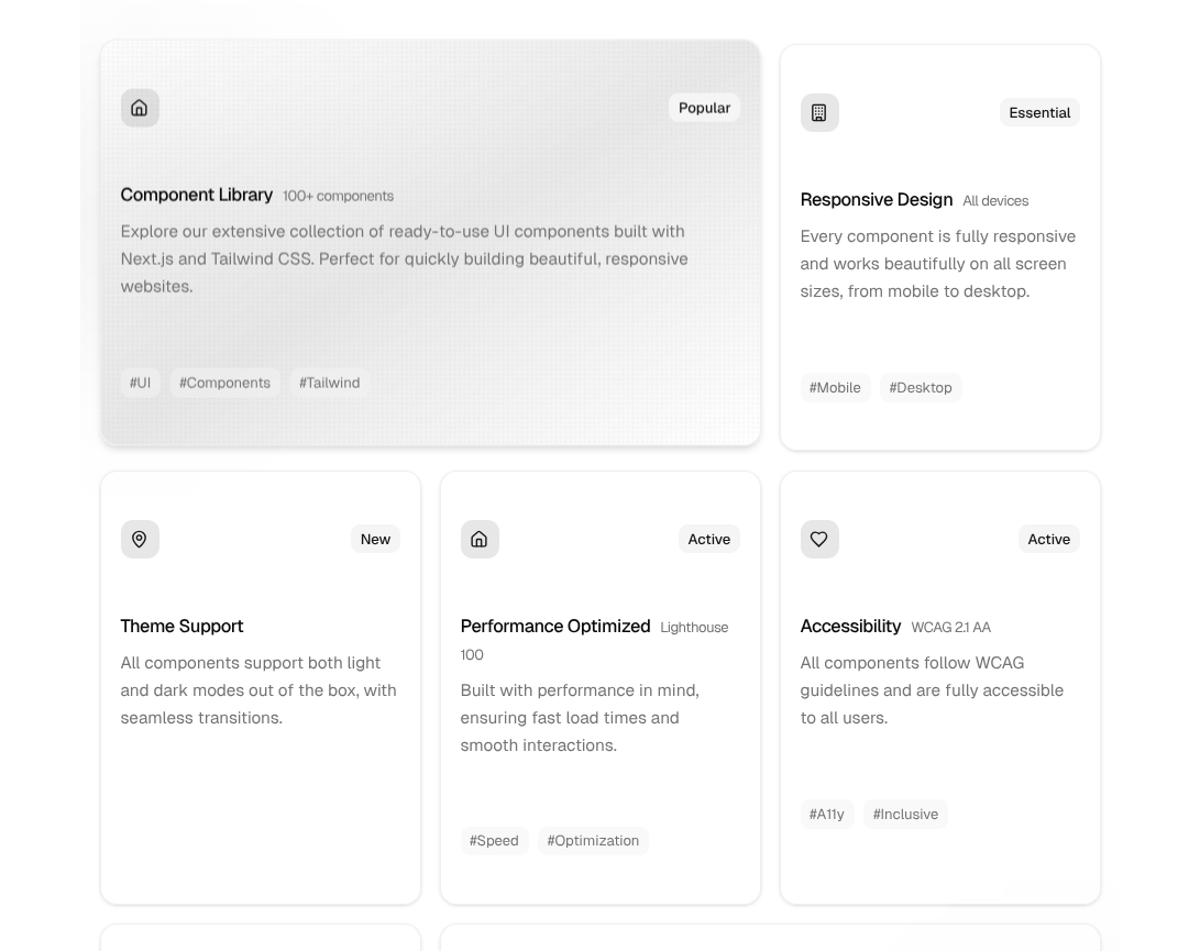
FeaturesBentoGrid

import BentoGrid from "@/components/features-bento-grid";
<BentoGrid />
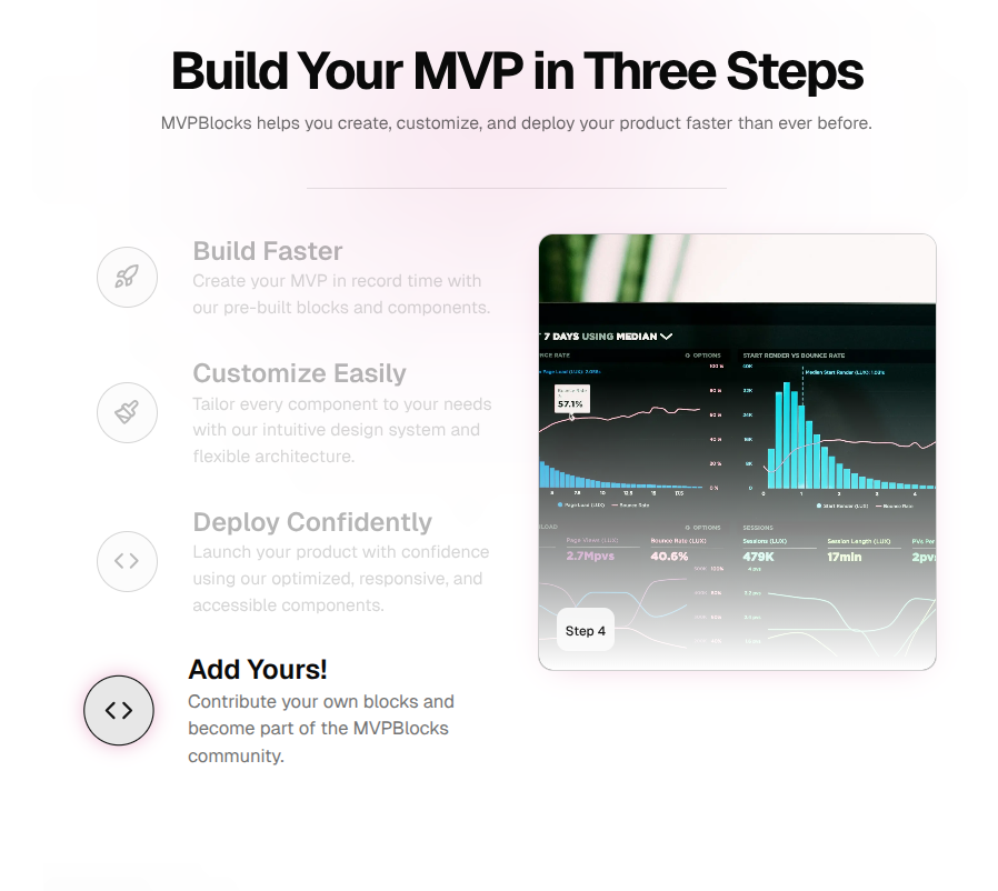
FeaturesAccordion

import FeatureSteps from "@/components/features-accordion";
<FeatureSteps />
Navigation & Layout Components
NavProjects

import Header from "@/components/header";
<Header />

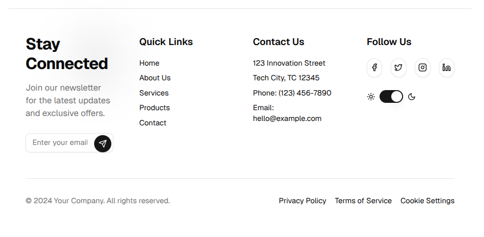
import Footer from "@/components/footer";
<Footer />
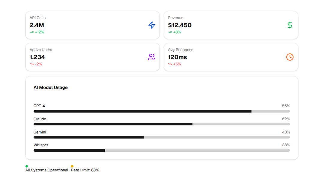
UsageDashboard

import UsageDashboard from "@/components/team-switcher";
<UsageDashboard />
UsageMeter

import { UsageMeter } from "@/components/usage-meter";
<UsageMeter value={75} label="API Usage" quota="750/1000" />
AI & Prompt Components
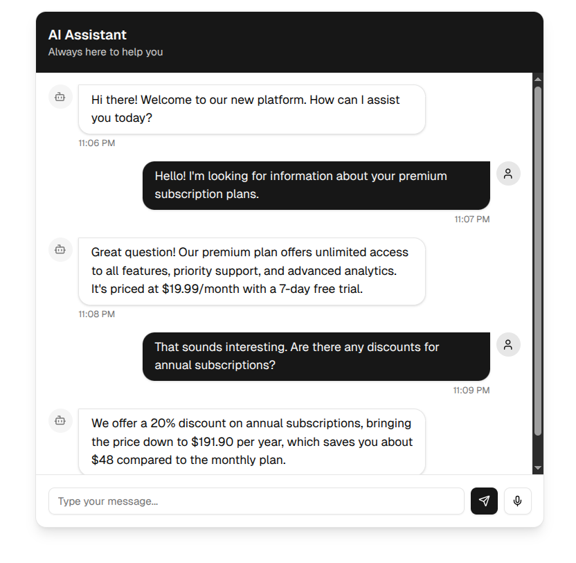
AIConversation

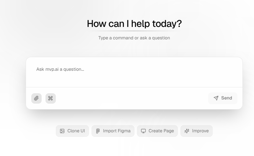
import AIConversation from "@/components/ai-conversation";
<AIConversation />
AIAnimatedChat

import AIAnimatedChat from "@/components/ai-animated-chat";
<AnimatedAIChat />
PromptInput

import AIConversation from "@/components/ai-conversation";
<PromptInput maxTokens={100} onSubmit={val => alert(val)} />
ResponseStream

import { ResponseStream } from "@/components/response-stream";

<ResponseStream response="Hello, world!" isStreaming />
Utility & Miscellaneous Components
ButtonLead
import { ButtonLead } from "@/components/button-lead";
<ButtonLead label="Join Now" />
Loader
import Loader from "@/components/loader";
<Loader />
import AppSidebar from "@/components/app-sidebar";
<AppSidebar />
Providers
import Providers from "@/components/providers";
<Providers>{children}</Providers>
